
In the crowded online world of 2025, where first impressions are formed in just 0.05 seconds, your website has to do a lot more than just “look good.” It needs to tell your brand story, build trust, deliver a seamless user experience, and gently nudge visitors toward taking action — all without them feeling manipulated.
Because here’s the truth:
📌 Design isn’t just about how something looks; it’s about how it works and makes people feel.
In this comprehensive guide, WPInnovate — your go-to team for Web Development, SEO, and UI/UX — breaks down pro website design tips that blend aesthetics, functionality, and conversion psychology. Whether you’re building from scratch, redesigning, or just tuning up, these strategies will ensure your site shines in 2025 and beyond.
Website Design Tips
A good website design starts with a clear purpose and audience in mind, using a simple and consistent layout that guides visitors naturally through the content. Prioritize mobile‑friendly, fast‑loading pages with clean typography, balanced white space, and a color palette that aligns with your brand.
Ensure navigation is intuitive, buttons and calls‑to‑action stand out, and images are both high‑quality and optimized for quick loading. Accessibility features like alt text, sufficient contrast, and keyboard navigation make your site usable for everyone. Above all, test regularly, study visitor behavior, and refine the design so it stays effective and engaging over time.
1. Understand the “Purpose First” Rule
Before you even open your design software or pick a template, define your website’s primary purpose. Is it to:
- Sell products?
- Generate leads?
- Build authority through content?
- Educate or entertain your audience?
Pro tip: Write a one-sentence mission statement for your website. Example:
“Our goal is to provide small business owners with actionable marketing strategies and a path to book consultations directly.”
This north star will guide every design choice — from navigation to CTAs (Calls to Action) to content structure.
2. Keep Navigation Simple, Yet Strategic
Think of your navigation as the GPS of your website. If visitors have to “guess” where to go, they’ll bounce faster than you can say “404 error.”
Best practices for 2025 navigation design:
- Limit main menu items to 5–7.
- Use clear, descriptive labels instead of jargon.(Bad: Solutions → Good: Web Design Services)
- Keep your menu consistent across devices.
- For mobile: use sticky nav for quick access.
WPInnovate Stat: User tests show that simplifying a menu can increase conversions by up to 16%.
3. Prioritize Mobile-First Design
More than 70% of web traffic is now mobile. Designing desktop-first is like building a second-floor apartment before laying the ground floor.
Mobile-first principles:
- Large tap areas for buttons (48px minimum).
- Fonts at least 16px for readability.
- Keep load time under 2 seconds.
- Avoid hover-based navigation (no mouse → no hover).
💡 2025 trend: Progressive Web Apps (PWAs) are becoming a standard for sites that need app-like performance without requiring downloads.
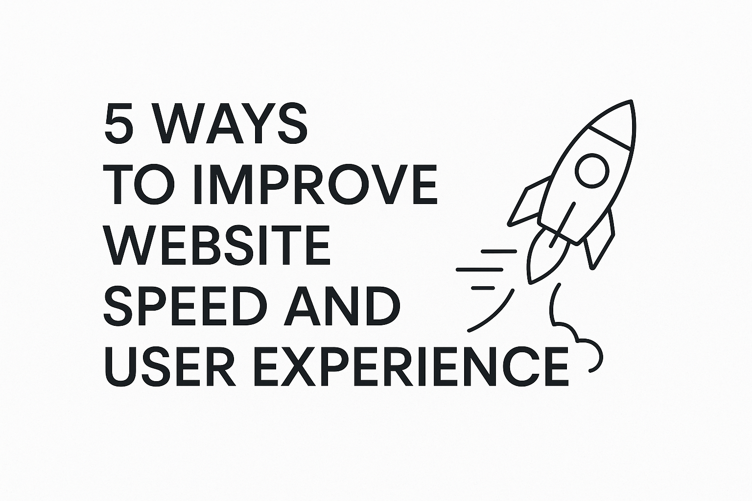
4. Speed Is King (and Queen)
Google’s Core Web Vitals are still a ranking factor — and now, users leave if loading takes more than 3 seconds.
Website speed tips:
- Compress images using WebP or AVIF formats.
- Use lazy loading for below-the-fold content.
- Minimize CSS and JS files.
- Choose a fast hosting provider (WPInnovate can recommend a few 😉).
Toolbox:
- Google PageSpeed Insights
- GTmetrix
- Lighthouse (built into Chrome DevTools)
5. Use Visual Hierarchy to Guide the Eye
Great design literally tells the visitor where to look first. This is where visual hierarchy shines.
Hierarchy factors:
- Size: Bigger elements grab attention.
- Color: Contrast can emphasize importance.
- Placement: Top-left areas attract first in Western reading patterns.
- Whitespace: Don’t fear it — it lets content breathe.
🔍 Test it: Squint at your website. What pops first? If it’s not your primary headline or offer, your hierarchy needs work.
6. Make Typography Work Harder
Typography is often underestimated, but it sets the tone for your brand.
2025 font trends:
- Sans-serifs for tech brands (e.g., Inter, Poppins).
- Elegant serifs for luxury/product sites.
- Variable fonts for flexibility and speed.
Typography rules:
- Never use more than two font families.
- Keep body text line length at 50–75 characters.
- Maintain high color contrast for accessibility.
7. Accessibility Is Not Optional
Accessibility is more than a good deed — it’s fast becoming a legal requirement in many regions.
Core accessibility checklist:
- Alt text for all images.
- Keyboard-friendly navigation.
- ARIA labels for screen readers.
- Color contrast ratio above 4.5:1.
Remember: accessible design also tends to be better design for everyone.
8. Integrate SEO From the Start
Too many designers treat SEO like an afterthought. The best websites weave it in from day one.
SEO-focused design tips:
- Use semantic HTML tags (
<header>,<main>,<article>). - Keep a logical content hierarchy with
<h1>–<h3>headings. - Optimize images with descriptive alt tags and filenames.
- Ensure your site is mobile-friendly and fast-loading.
📌 Keyword in action: Integrate “website design tips” in at least one H1, H2, and a few paragraph texts (just like this blog).
9. Conversion-Optimized CTAs
The prettiest site is useless without clear calls to action.
CTA principles:
- Visually distinct (high contrast, enough whitespace around them).
- Action-oriented text (“Start Your Free Trial” beats “Click Here”).
- Above-the-fold and repeated when needed.
- Always link to relevant next steps.
10. Employ Story-Driven Content
Humans are wired for stories, not sales pitches.
Example structure:
- Present a relatable problem.
- Show the solution — your product/service.
- Back it up with proof (reviews, case studies).
- End with a clear next step.
🌟 Bonus: Pair each key section with compelling imagery or short looping videos.
11. Don’t Ignore Microinteractions
Microinteractions = subtle animations or feedback that enhance UX delight.
Examples:
- Button changes color on hover.
- A progress bar during form submission.
- “Scroll to top” button that appears dynamically.
🚀 Pro-level: Use them to signal state changes, like “Added to cart” confirmations.
12. Keep Testing, Keep Iterating
Design isn’t “set and forget.”
Run A/B tests, heatmaps, and usability sessions every few months.
Tools:
- Hotjar / Microsoft Clarity for heatmaps.
- Google Optimize for A/B testing.
- UserTesting.com for feedback.
13. Security = Design Confidence
A hacked or unsecure site kills trust instantly.
Security must-haves:
- SSL certificate (HTTPS).
- Regular software/plugin updates.
- Secure hosting.
- Clear privacy policy and terms page.
14. 2025 Design Trends to Watch
Here’s what’s hot this year:
- Neumorphism 2.0: Softer, more accessible.
- Dark mode toggle as a standard.
- AI-generated content visuals (carefully edited for accuracy).
- Brutalist layouts for niche brands that want to stand out.
15. Your Website as a Growth Engine
A great website in 2025 is not just a digital brochure — it’s your growth engine.
- Designed for UX.
- Built for speed.
- Optimized for SEO.
- Capable of adapting fast.
Final Thoughts
By applying these website design tips, you’re not just creating a “pretty” site — you’re crafting a conversion-focused, audience-friendly experience that works for your brand 24/7.
At WPInnovate, we believe in blending technical excellence with human-centered design so your website doesn’t just exist — it performs.